
By Gordhan Bagri and Munshi Imran Hossain with H A S Shri Kishore
Shiny (from RStudio) is one of the most popular R packages. The package allows programmers to create applications with interactive user interfaces. These applications can then be deployed for non-programmers to perform analysis. Non-programmers can, therefore, make use of the statistical capabilities of R by means of point and click. This is one of the reasons why its use has been on the rise in the last few years.
We wrote briefly about this in Creating Data Visualizations with R and Shiny. In this blog we take a deeper dive into the details of creating a simple Shiny application.
General Architecture of a Shiny Application
Shiny applications are, broadly speaking, made of two components - a user interface (UI) and a server. The UI is visible to the user and available for taking input from the user. The output resulting from computations is also displayed on the UI. The server is the back-end business logic in which computations are performed on the input given by the user, to generate the output.
The UI and server are objects in R and they can be coded in a single file or in different files. The following is a snapshot of the general structure of this code.
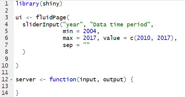
Figure 1: A Skeletal Structure of Shiny Code
Creating a Simple GUI
The above code itself will generate a graphical user interface (GUI). However, this GUI will only be a blank HTML page that is not very useful. We would like to add web elements into the GUI so that the user can interact with the application. Such elements are called widgets. Check boxes, radio buttons, slider bars, drop-down menus are some examples of commonly used widgets.
To add a widget to the UI, we need to write the widget function in the ui method as shown in Figure 1. For example, if we wish to create a slider input that selects the time interval over which some data should be filtered, the code for the widget would be as follows -
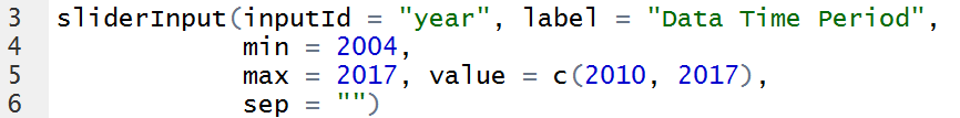
Figure 2: The UI Code for a Slider Input
And the corresponding slider as seen by the user is -
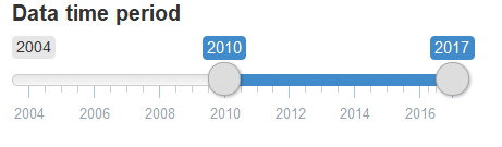 Figure 3: A Slider Input
Let us understand the code that went into the ui object. The first argument of the function is inputId to which we have assigned a value, year. This is the ID that R will use to identify this slider control. The second argument is a label, to which we have assigned a value Data time period. As the name of the argument suggests, this is the label that will appear on the UI. These are two arguments that must be defined for every widget’s function. The description of other arguments can be found in the help manual for the package.
As seen in Figure 1, the Shiny code also contains a server object. This is a function that has two arguments, input and output. The input is an object that holds the IDs of the widgets on the UI. The input values given by a user are accessed in the business logic written in the server using the IDs contained in the input object. As an example, the following code snippet shows how the values of year indicated by the start and stop positions of the slider are accessed in the business logic.
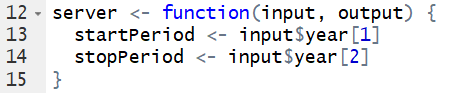
Figure 4: The Server Code Accessing Values of the Slider Input
Creating Plots With Inputs From User
The Shiny application environment makes it easy to create interactive plots using inputs from the user. We will use adverse event data available on the FDA's website.
Let us consider the plot shown below between cases reported and countries from which the cases have been reported.
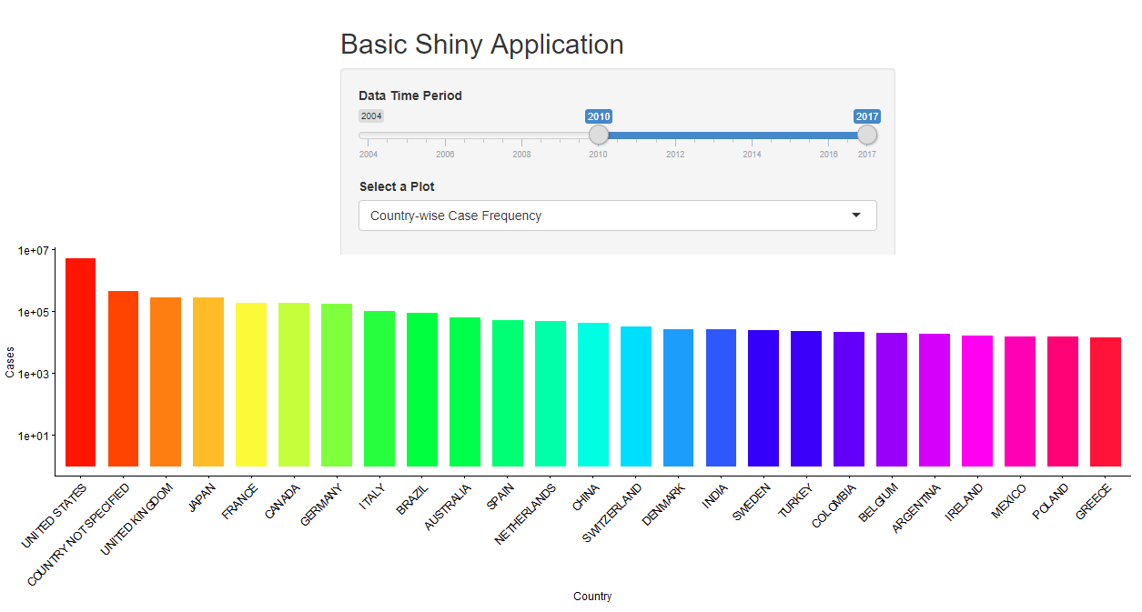
Figure 5: Interactive Plot in Shiny
In the above example, we plot the total number of adverse events reported by each country. The user can adjust the time period by using the Slider-Input to view data corresponding to a particular period. User can also see the “Year-wise case frequency” by using the appropriate option from Select a plot drop down menu. For this example, we will stick to the time period shown in the slider-input in Figure 5.
To create an interactive plot, we first need to create the plot position on the user interface. We can create the plot on the UI by using the following highlighted command.
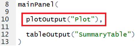
Figure 6: UI Code for an Interactive Plot
This will create an object of plot with ID = “Plot” on the UI. Once the plot placeholder is created on the UI, we can customize the plot in the server by using inputs from the user.
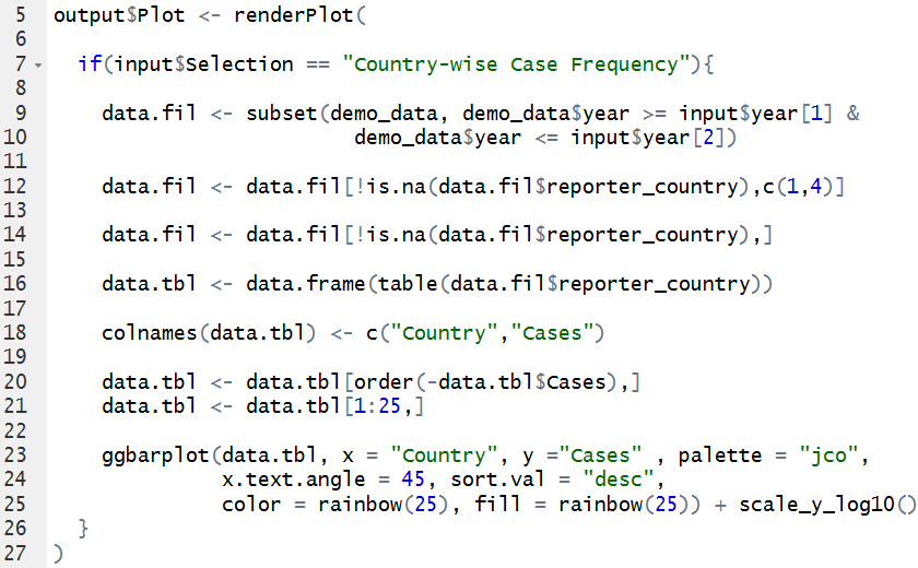
Figure 7: Server Code for Interactive Plot
renderPlot function is used to display the plot on the UI. We access the plot specified on UI using output$Plot as we have given ID = Plot to the output object.
The above R code gets information about time period from user using input$year. The data is filtered using inputs provided from the user and the appropriate plot is displayed on the UI. The above plot is created using “ggplot2” package, which is loaded into the R environment as shown in Figure 1.
Creating (Summary) Tables
Similar to the plot, we can also display interactive summary tables using R Shiny. We will continue with the above example of adverse events data to display year-wise counts of events reported.
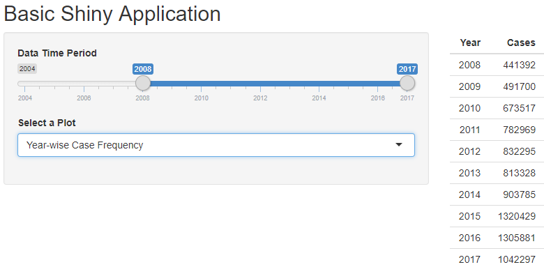
Figure 8: Interactive Table in Shiny
The above table displays year-wise counts of cases reported. The user can switch from country-wise to year-wise plot using the drop-down Select a Plot. For displaying table on the UI, we need to create the table placeholder on the UI similar to that for the plot. This can be done by using the following snippet of code.
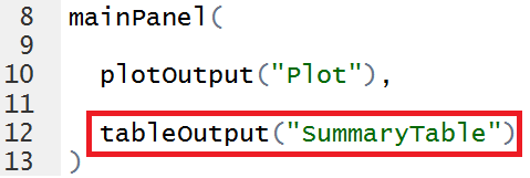
Figure 9: UI code for Interactive Table
This will create an output object of type “Table” on the UI with ID = “SummaryTable”. We can access this table in the server using the ID specified. We can display the table on the UI by using renderTable function in the server.
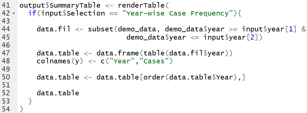
Figure 10: Server code for Interactive Table
The above R code confirms that the user has selected “Year-wise Case Frequency” in the drop-down menu. It then filters the data according to the time period specified by the user in “Data Time Period” sliderInput and displays the appropriate output.
Similarly, R Shiny supports multiple input/output objects, details of which can be found at Shiny Widgets Gallery.
Conclusion
We have described a very simple Shiny application in this post. But even with this simple application we can appreciate two important things. Firstly, such an application can be used by non-programmers for analysis of data, making use of the vast number of statistical methods that are available in R. Secondly, the Shiny package makes it very convenient for R developers to quickly develop such applications.
There are several potential applications within the biopharma sector from creating pharmacovigilance analysis as described in this blog, to enrollment forecasting simulation, or visualizing genome data using advanced graphics. It is, therefore, not surprising that the package has generated a lot of interest in the biopharma user community.
Clients are increasingly asking Cytel to support biostatistics and programming functions by providing resources with R and Shiny skills, or helping to develop clients’ in-house teams. To discuss a programming, data science or training project, please contact us.
To learn more about our data science services click the button below.

About the Authors
 Gordhan Bagri is a Software Affiliate at Cytel and currently works as a Software developer and Subject Matter Expert. He has 4 years of experience working in the areas of software development and data science. He holds an M. Tech in Biomedical Engineering, from IIT Bombay. His interests include clinical trials simulations and machine learning. Outside of work, he enjoys playing football.

Munshi Imran Hossain is Senior Data Scientist at Cytel. He has 6 years of experience working in the areas of software development and data science. He holds an M. Tech in Biomedical Engineering, from IIT Bombay. His interests include processing and analysis of biomedical data. Outside of work, he enjoys reading.
Further Reading
Creating an R Package Template: A Guide
Data Structures in R: A Primer
Syntax and Variables in R: A Primer